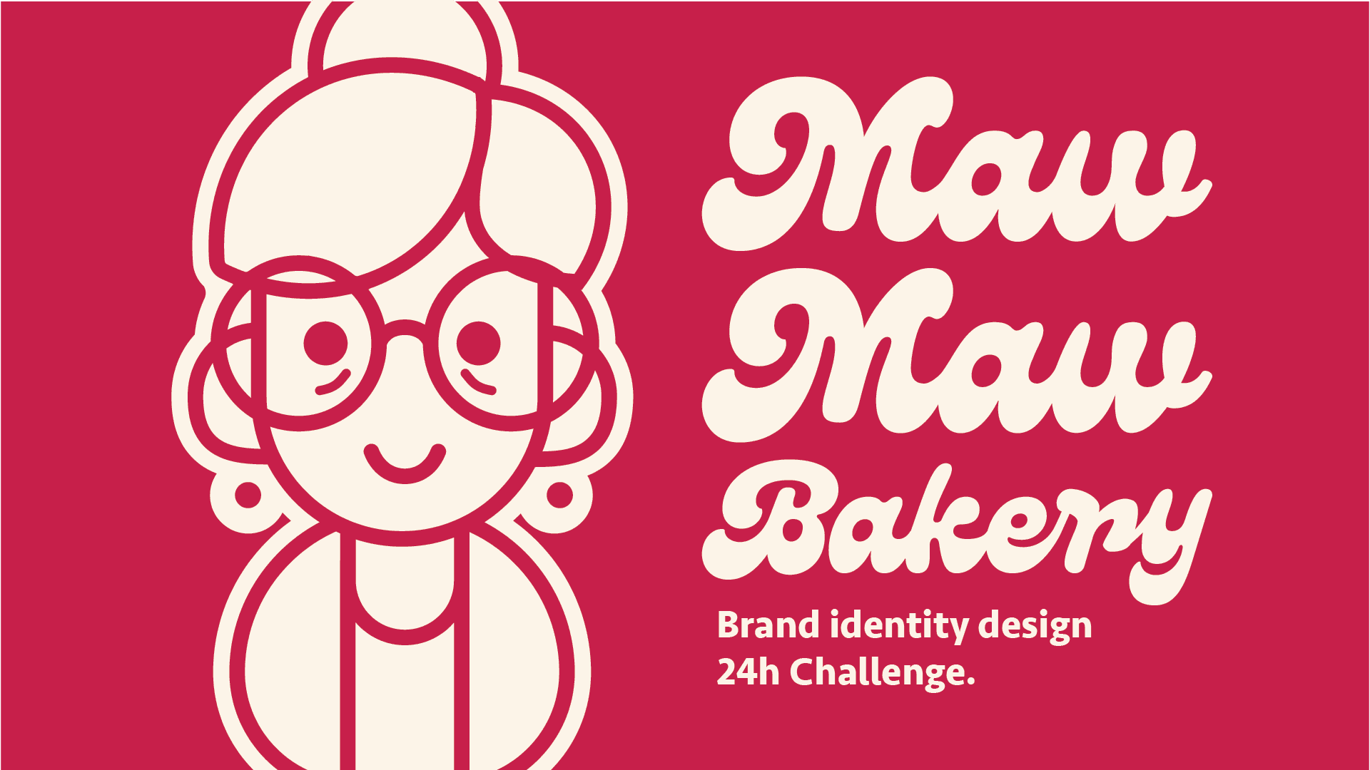
Maw Maw Bakery
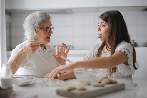
What if a group of sweet, spirited grandmothers started their own bakery?
Introduction
This project was created as part of a 24-hour design challenge to build a brand from the ground up. The deliverables included core brand elements and visual mockups. The concept was inspired by the nostalgic memory of eating your grandmother’s homemade cookies as a child.
Problems and Goals
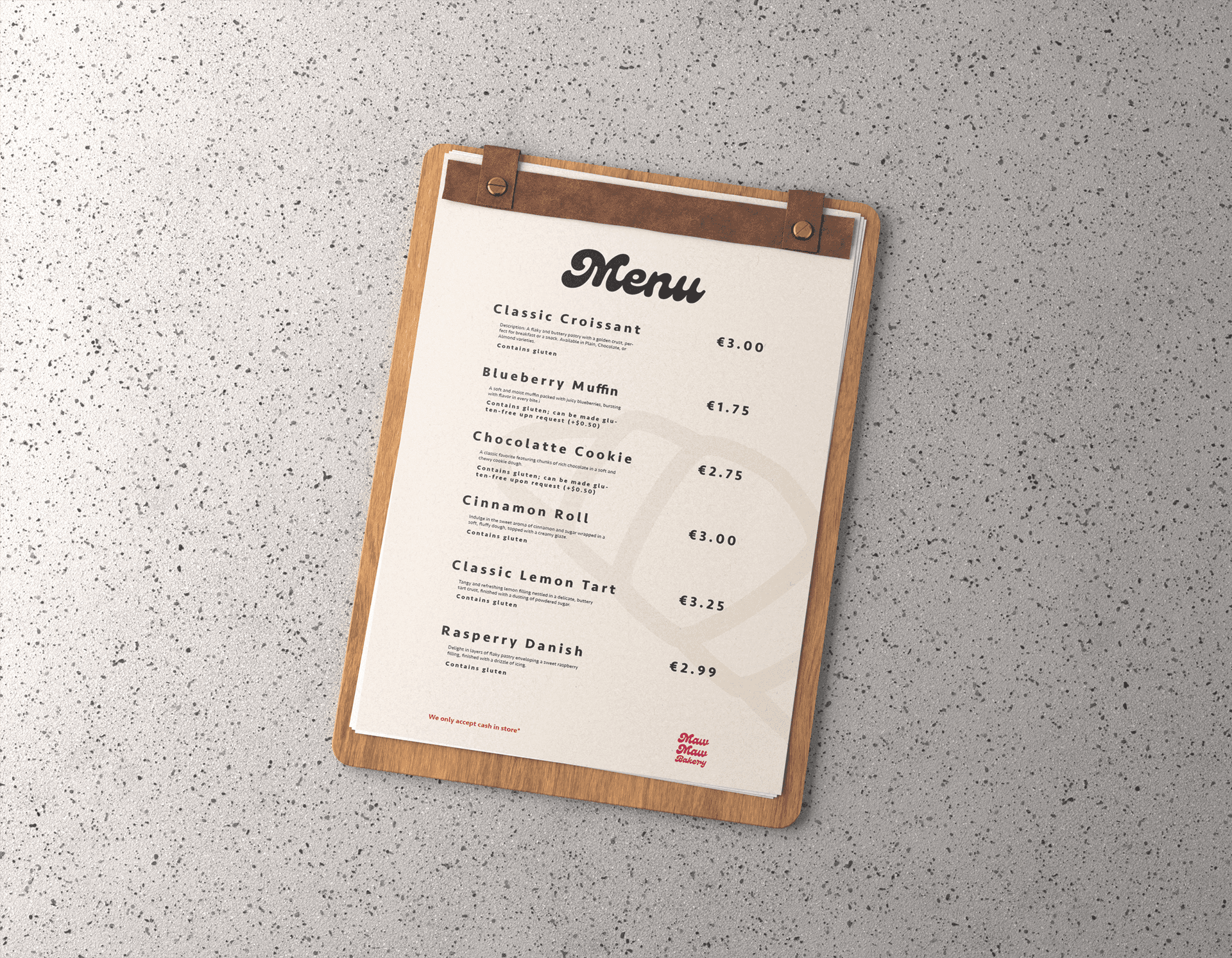
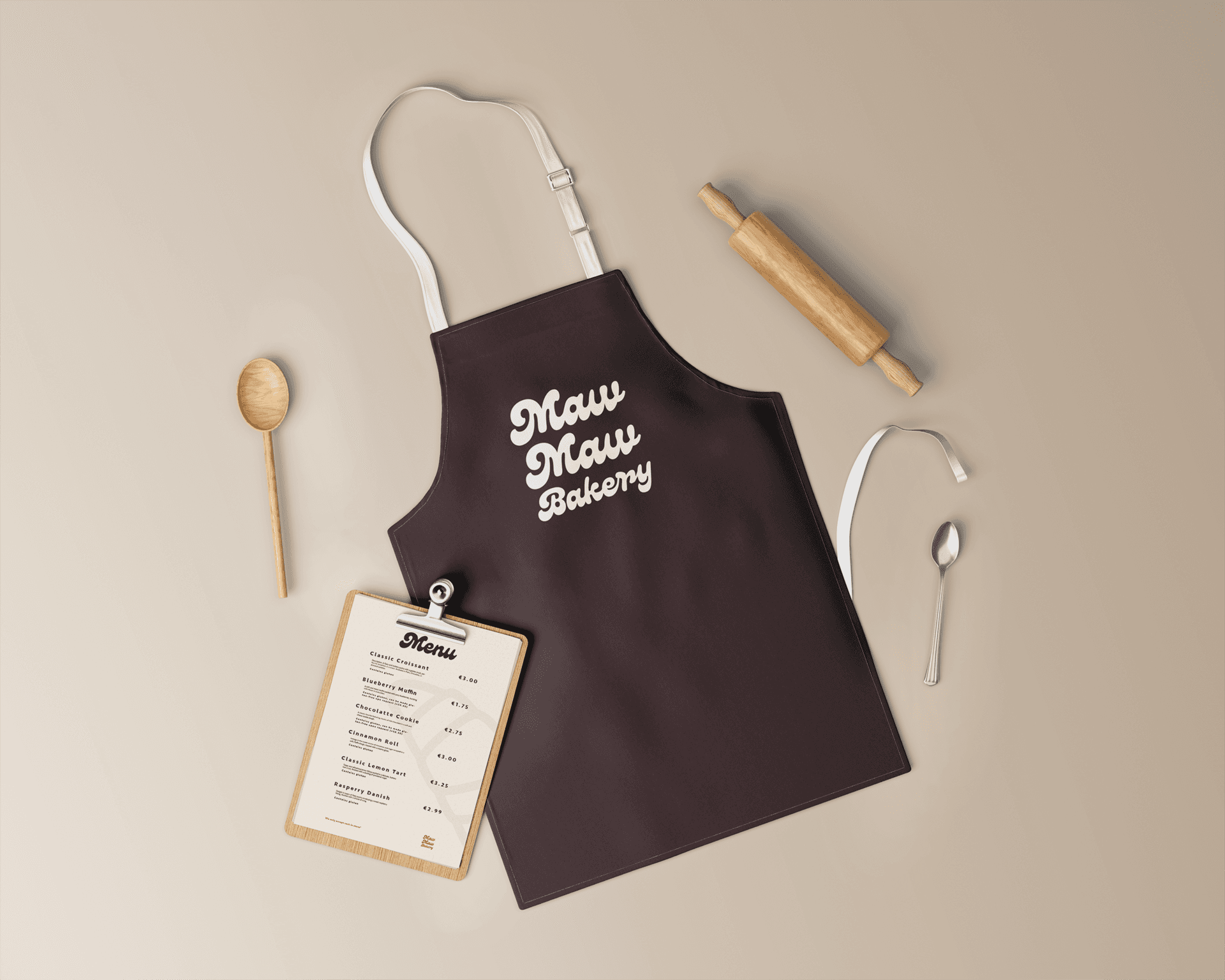
With limited time, the goal was to develop a flexible visual identity that could be easily adapted across different applications—from packaging to social media. Efficiency and versatility were key.
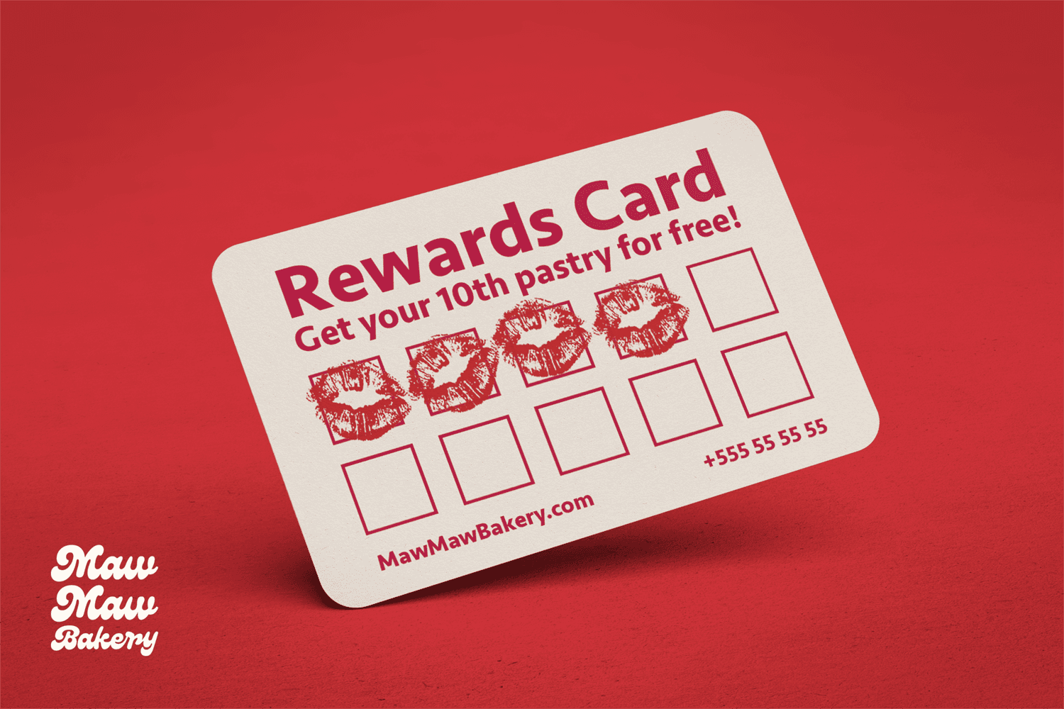
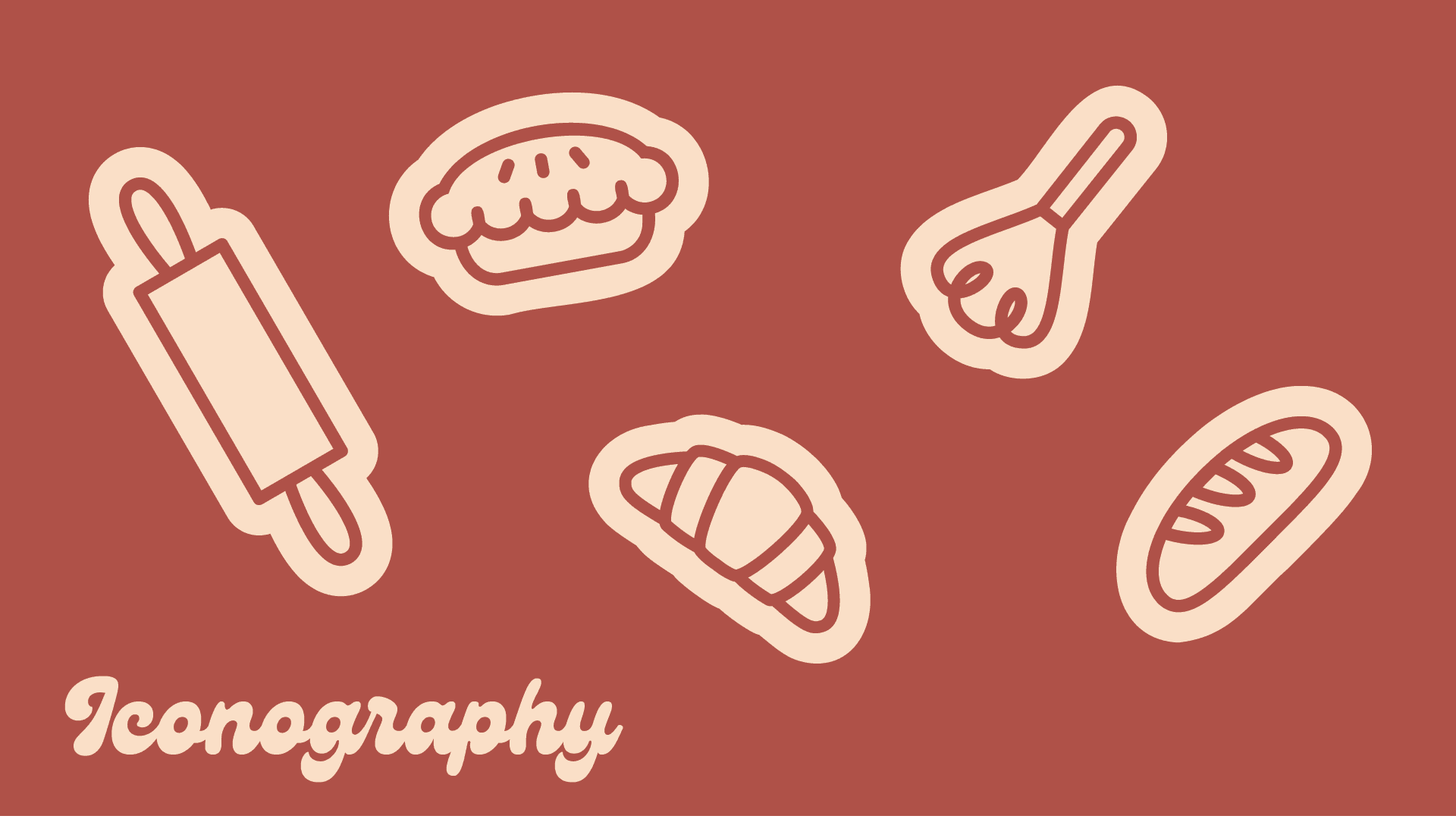
Branding Elements
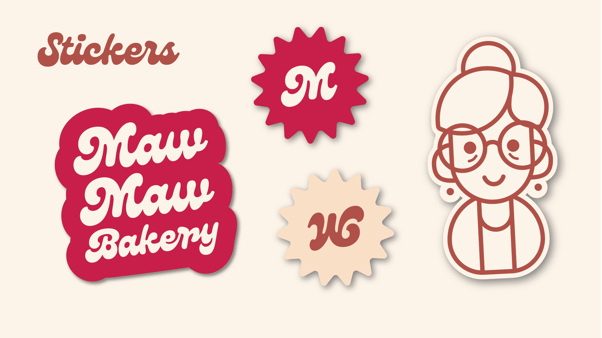
The illustrated logo features a friendly elderly woman, designed to evoke feelings of comfort, familiarity, and trust—like a beloved grandmother figure.
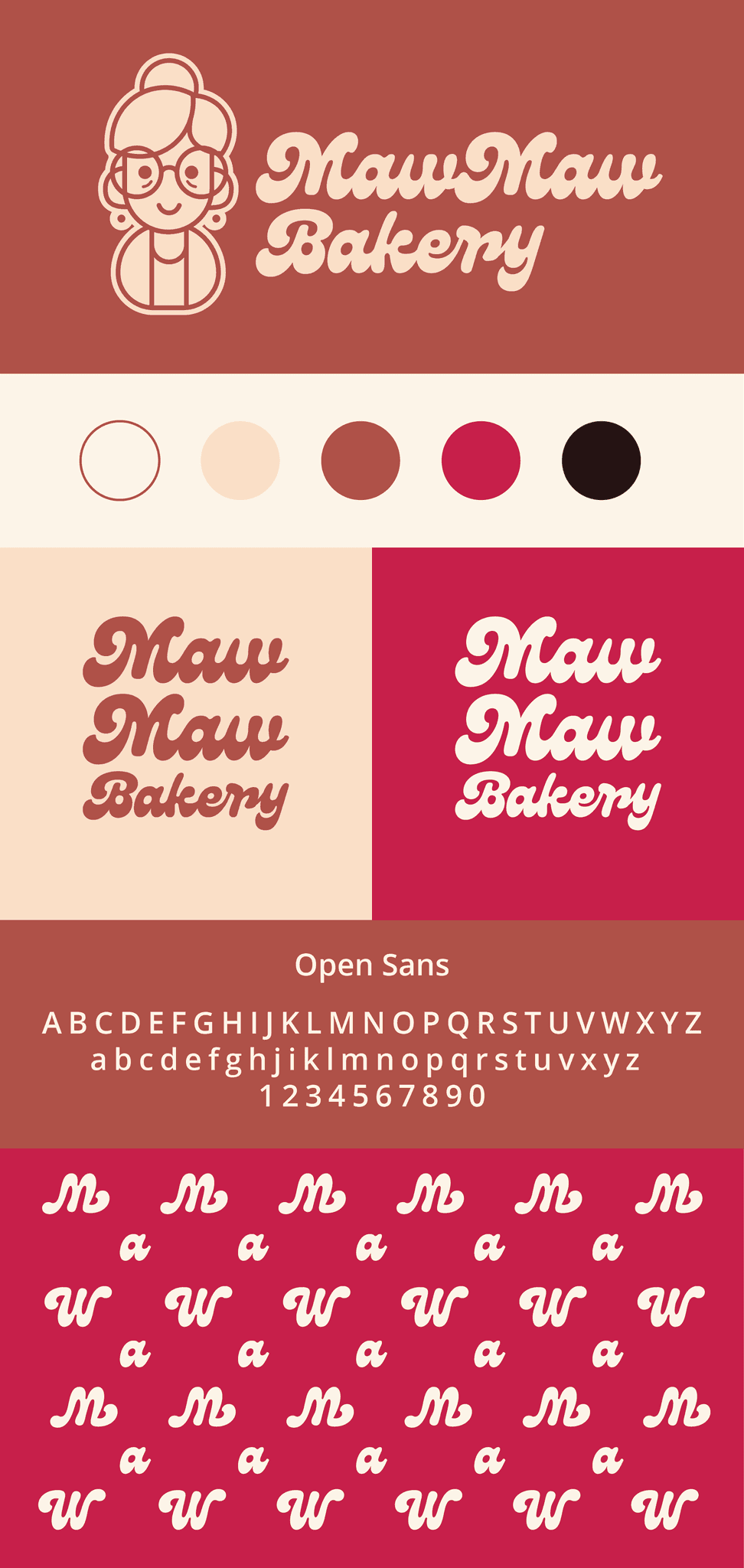
Typography plays a playful role in the brand identity. A custom type treatment emphasizes the symmetry between the letters "M" and "W", allowing the logo to work both right-side up and upside down. This creates opportunities for dynamic patterns, especially useful for packaging and branded materials like wrapping paper.
Concept Development
The color palette was the starting point. Warm tones of beige and brown were chosen to echo the look and feel of freshly baked goods. A rich cherry red was added to complement these tones and stimulate appetite—its inspiration came from a photo of a cherry pie.