Explore & Roam
A travel guide agency that likes to explore more than just locations. Read how Explore and Roam takes in all considerations of traveling.

Introduction
We offer a variety of authentic destinations. We can provide authentic local guides because of our easy-to-use app. Our target audience is people who live alone. We want to convey a sense of eagerness, while at the same time being approachable.
Branding
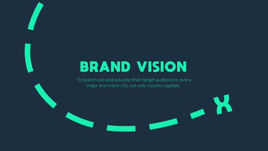
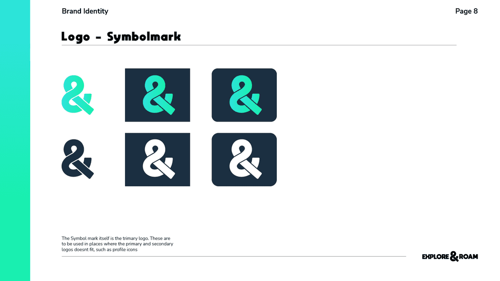
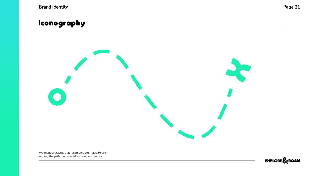
Our logo mark symbolizes the purpose of traveling with Explore and Roam. With a set destination, path, and start. With references to other visual cues for traveling, such as a set point and X for showcasing an old map. And having a resemblance to a roundabout highway
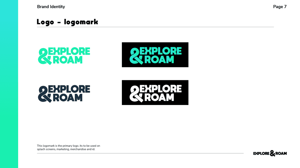
We set the & Symbol as our logo to showcase that guided tours are more than exploring. It takes in culture, appreciates architecture, and has an educating good time.
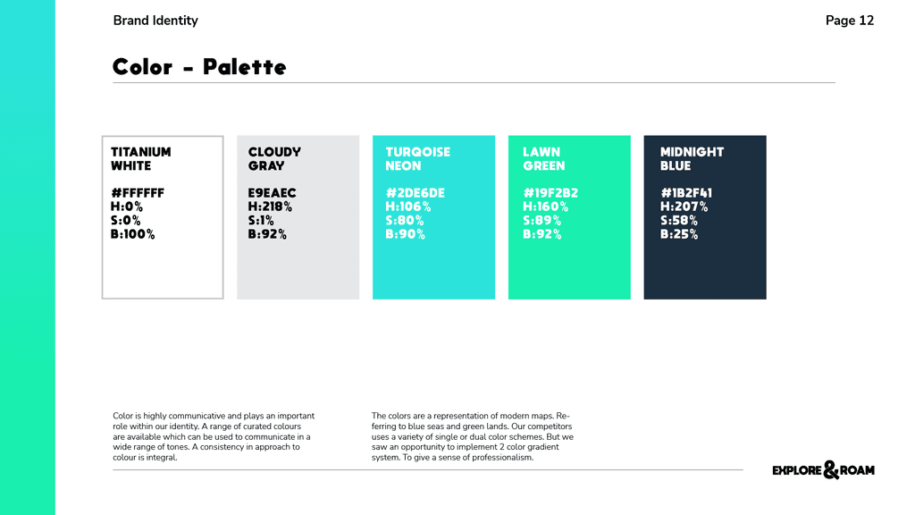
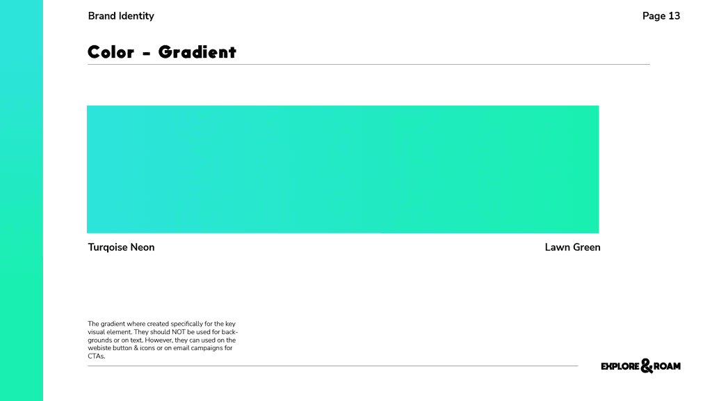
The colors are a representation of modern maps. Referring to blue seas and green lands. Our competitors use a variety of single or dual-color schemes. But we saw an opportunity to implement a 2-color gradient system.


UX App Design
Common Pain points in other apps
Not being able to book private tours or group tours
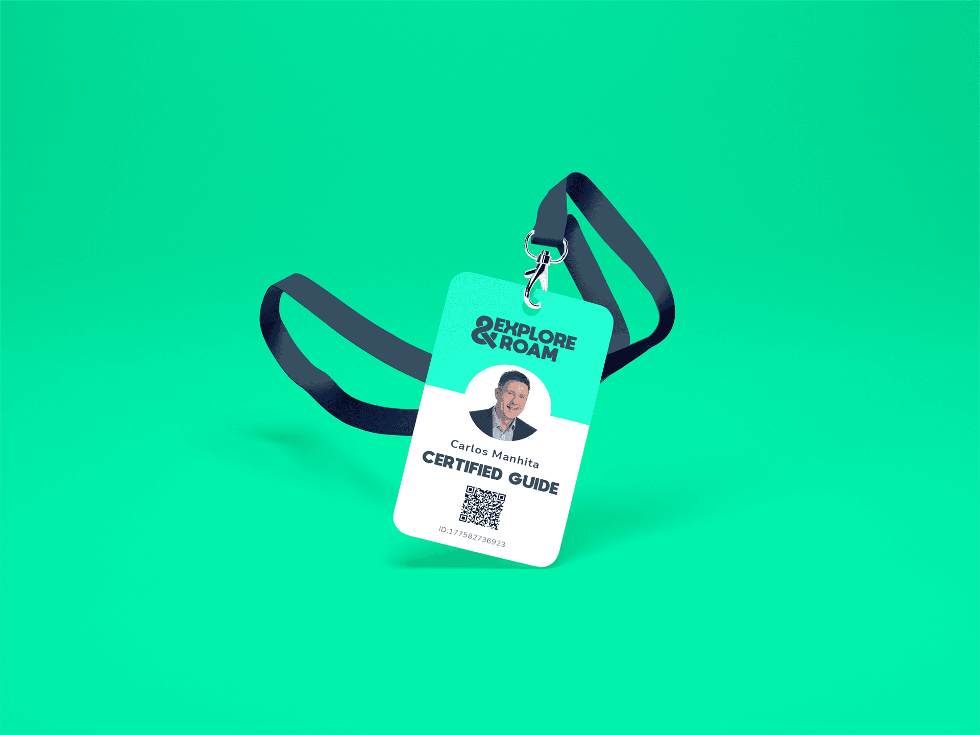
Tour guides not being professional
Cancelation time policy
Not authentic
Language Barriers
Tour guides canceling
Satisfaction Points
Storytelling
Local treasures
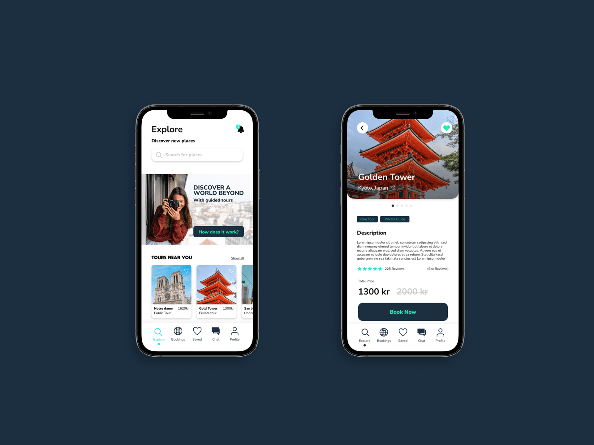
App Features
Choosing private or group guiding.
Night or day guide
Bicycle, walking, or bus tour