Maw Maw Bakery
What if a group of sweet, spirited grandmothers started their own bakery?
Overview
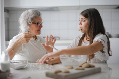
Maw Maw Bakery is a homestyle bakery built around the comfort of your grandmother’s baking: warm, familiar, and made with genuine care.
The brand speaks to families, nostalgic younger adults, and older customers who immediately recognize that feeling of sitting at grandma’s kitchen table with something freshly baked.

Goals and Challenges
Maw Maw Bakery was a brand built on a genuinely distinctive idea — grandmother energy as a fully committed aesthetic, not a decorative nod. The problem was time. As a 24-hour challenge, the brief demanded a complete brand system — identity, mockups, and a visual language that could scale — built from scratch in a single day.
That constraint shaped the core design question: what single element, if designed well, could do the most work across the widest range of contexts? A logo that only works at one size, in one color, on one surface is a luxury a time-pressured project cannot afford. The identity needed a reusable core — something that could stretch from a paper bag to a wrapping paper pattern to a social media avatar without losing its warmth or recognition.
Concept, sketching & development
The creative direction centered on comfort, warmth, and sweetness, creating a brand that feels small, handmade, and cared for.
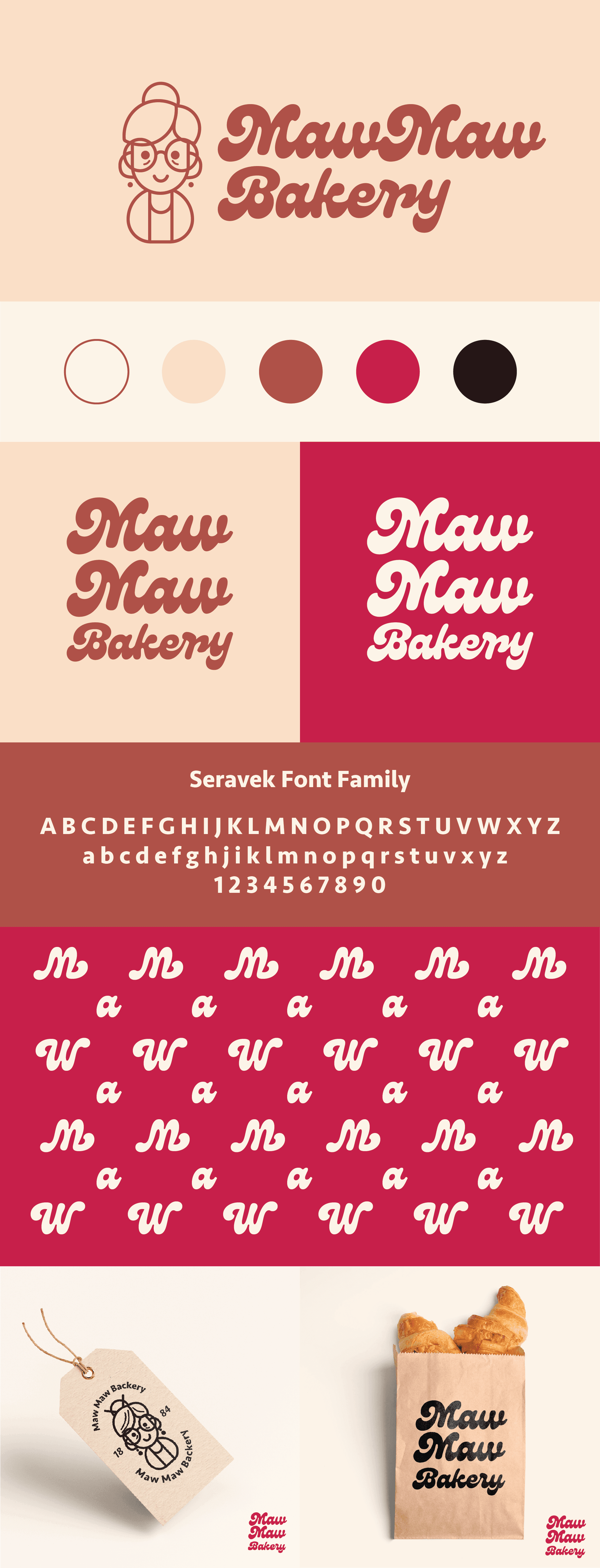
Beige and brown reference freshly baked bread, while red adds energy and evokes classic cherry pie. The illustrated grandmother logo provides a familiar, trustworthy face without becoming overly sentimental.
Expressive typography adds a playful edge. Because M and W mirror each other when rotated, the wordmark could become a repeating pattern across wrapping paper, bags, and tissue. This turned one distinctive element into a flexible system inspired by vintage American bakeries, recipe cards, and mid-century food graphics.

Brand Elements
The completed identity feels warm, recognizable, and established despite being created in just 24 hours. The illustrated grandmother, cherry pie-inspired palette, and expressive typography create a distinctive system across bags, boxes, wrapping paper, and stickers.
At its center, the M/W typographic flip transforms a practical solution into the brand’s most memorable feature, creating a reusable pattern that adds personality across every application.


The 24-hour challenge was less about producing quickly and more about finding the one decision that could shape the entire identity. For Maw Maw Bakery, that was the M/W letterform, which became the foundation for the pattern system and wider visual language.
The project reinforced a simple principle: strong small-business identities do not need complexity. They need one genuine idea, executed consistently. For Maw Maw Bakery, that idea was grandmotherly warmth, and the time constraint helped keep the identity focused around it.