Nattassja
A playful visual identity for a whimsical storyteller breaking into freelancing

Overview
Natassja Berkan — known professionally as Natti — is a Swedish children’s book illustrator and animator creating warm, imaginative worlds where the everyday becomes extraordinary.
Her work speaks to both children and the adults who discover and commission it. Children connect with playful characters and storytelling, while parents, publishers, educators, and authors value quality, trust, and a distinctive artistic voice.
Her brand reflects this creative territory: inclusive, nature-rooted, emotionally intelligent, and as distinctive as the work itself.

Goals and Challenges
For freelance illustrators, the work and the person are inseparable. Publishers, authors, and editors are not only evaluating the illustrations, but deciding whether to trust the artist with months of collaboration.
Without a cohesive personal brand, strong work can lose its context and feel like a collection of projects rather than an established practice.
Natti also needed to stand apart from the children’s illustration market’s typically sweet or deliberately naive styles. Her work balances sophistication, emotional intelligence, and inclusive warmth, appealing to children while remaining genuinely beautiful to adults. The brand needed to communicate both.

Concept, sketching & development
The strategy began with Natti’s core values: creativity, inclusivity, empathy, curiosity, playfulness, education, quality, environmental responsibility, collaboration, and timelessness. Rather than relying on typical children’s branding, the identity needed to feel warm without being saccharine, playful without being childish, and imaginative while remaining professional.
The visual identity centers on a custom NB monogram and sharp, fluid serif typography, balancing personality with credibility. Nature-inspired motifs such as sprouts, trees, rabbits, and hand-drawn elements connect the brand directly to Natti’s illustration style.
A warm red-orange, nature-rooted green, and golden yellow create a distinctive, accessible palette. Paired with elegant display typography and a clean body typeface, the system works across portfolios, stationery, and social media while appealing to both children and publishing professionals.

Brand elements
The completed identity gives Natassja Berkan the coherence of a small creative studio while remaining distinctly personal. The NB monogram, warm logotype, and recognizable color system create consistency across social media, print, and other brand touchpoints.
The guidelines bring together logo configurations, color, typography, nature-inspired motifs, and practical social media templates into one flexible system.
The result is a brand that builds familiarity before first contact, helping turn discovery into trust and potential commissions.
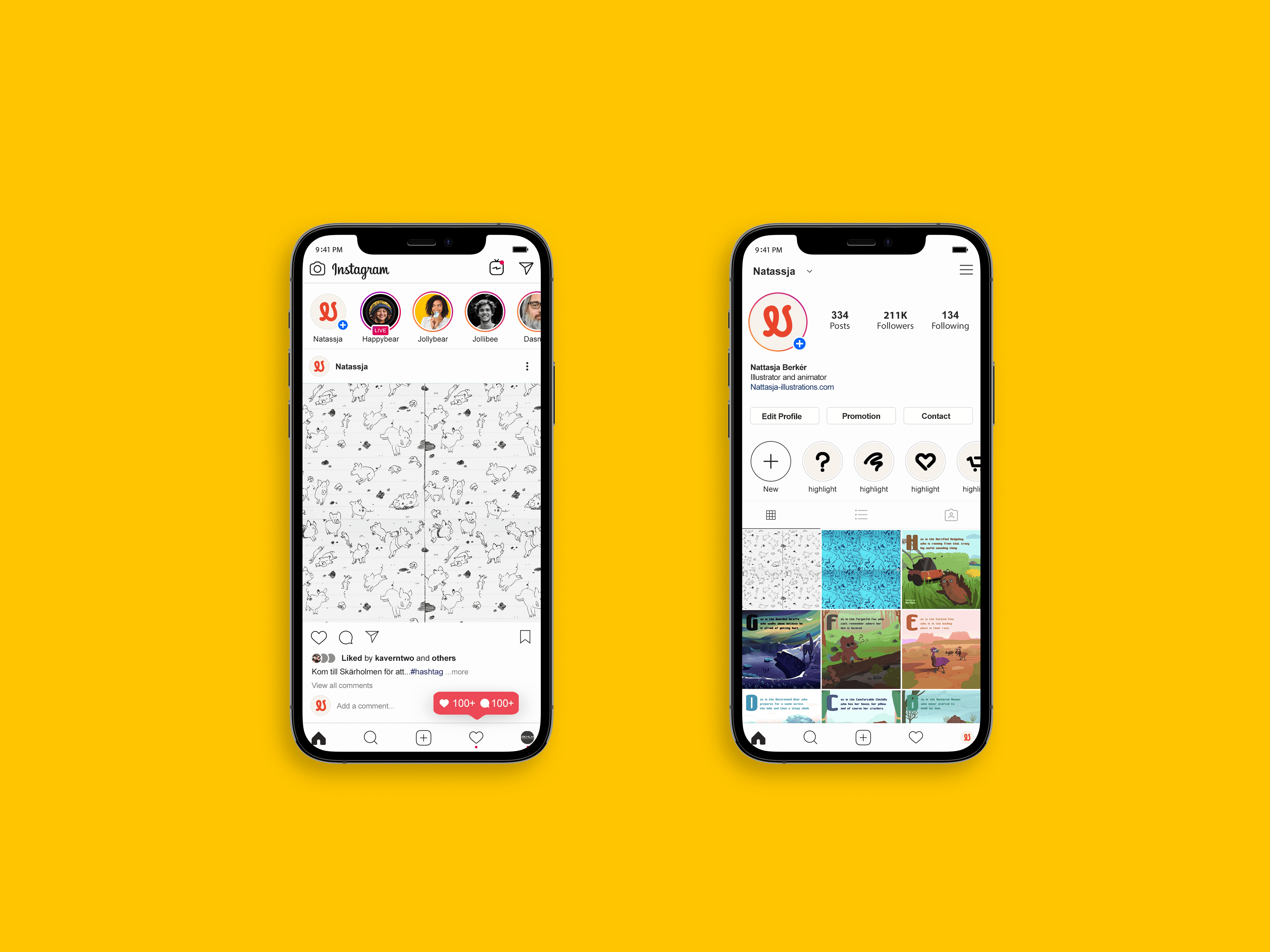


Natti’s personal brand was ultimately about visibility. The quality, warmth, and emotional intelligence were already present in her work; the identity gave those qualities a consistent way to be recognized and trusted.
For creative practitioners, personal branding is less about self-promotion and more about professional clarity. A publisher or author should quickly understand what Natti’s work feels like, what kind of collaborator she is, and whether she fits their project.
The final identity creates a credible framework for her values, turning an existing creative practice into something clearer, more recognizable, and easier to connect with.